Enhancing User Experience and User Engagement Through a Digital Rebrand
We enhanced the user experience, increasing engagement, and drastically improving lead quality through a digital rebrand implementation.
Focus
Problem
Cappex, an EAB company, wanted to rebrand itself as a design-forward organization with a look and feel that was more aligned with the expectations of its key demographic (a youthful audience). COLAB was iteratively releasing enhancements to their existing Drupal site, so there was an easy on-ramp for our team to take on the challenge.
Solution
We found creative ways to integrate the new brand, Appily, into the design without inflating the development effort and budget. Balancing design and development is always a challenge, but one we are used to and adept at managing. The result was a redesigned digital experience that effectively infused the energy and vibrancy of the new brand into the existing digital property.
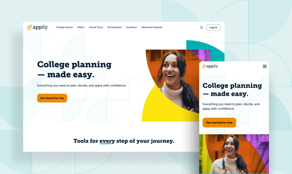
Integrating the new identity on the web
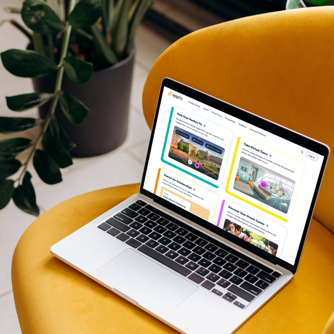
We worked closely with Appily to understand the intent behind their rebrand. Building on the brand style guide created for the redesign, we implemented a digital brand system in Figma that reflects the updated brand and captures the excitement of the organization. The web redesign included fresh application of typography, a new color palette, and upgraded interior pages.
Typography
Color Palette
Brand Elements

UI Elements: Components
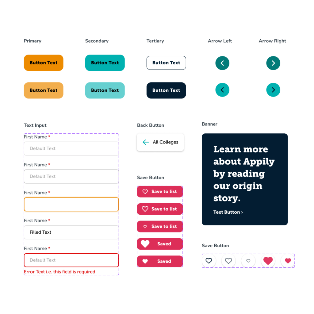
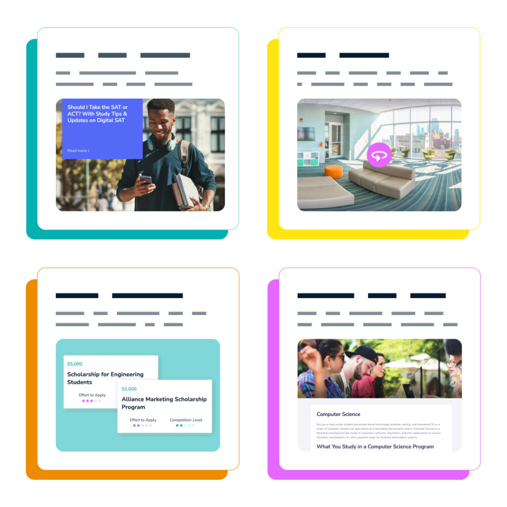
UI Elements: Cards
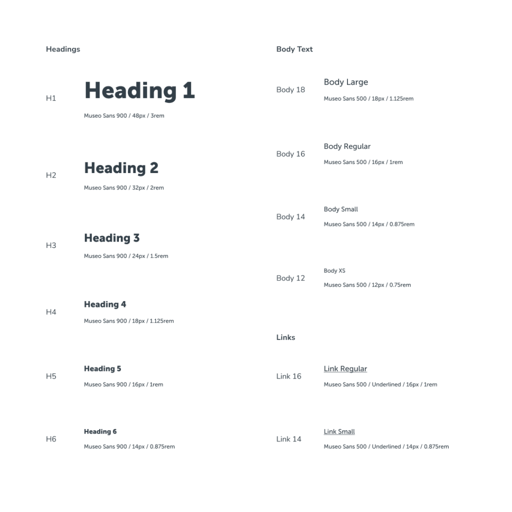
UI ELements: Type System
A positive experience on the go
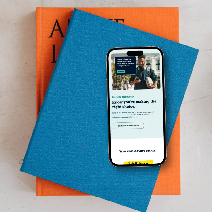
As the majority of Appily.com’s audience accesses their platform through mobile devices, prioritizing mobile visitors was a crucial aspect of the rebrand.
This trend significantly impacts user experience and engagement, as users demand seamless navigation and swift access to content on their mobile screens. By focusing on mobile optimization, the redesign can effectively cater to its primary audience, boosting customer satisfaction and ultimately driving business growth.
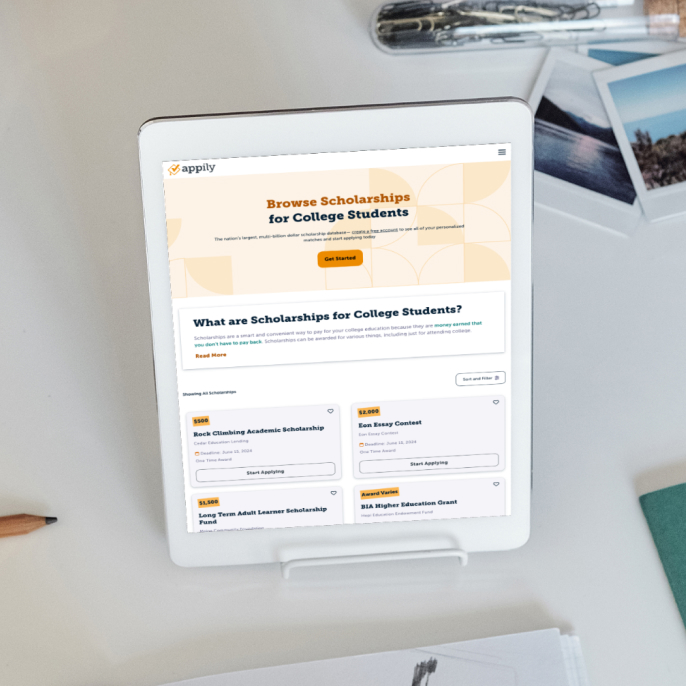
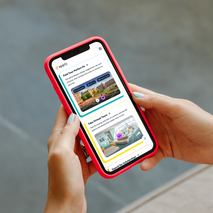
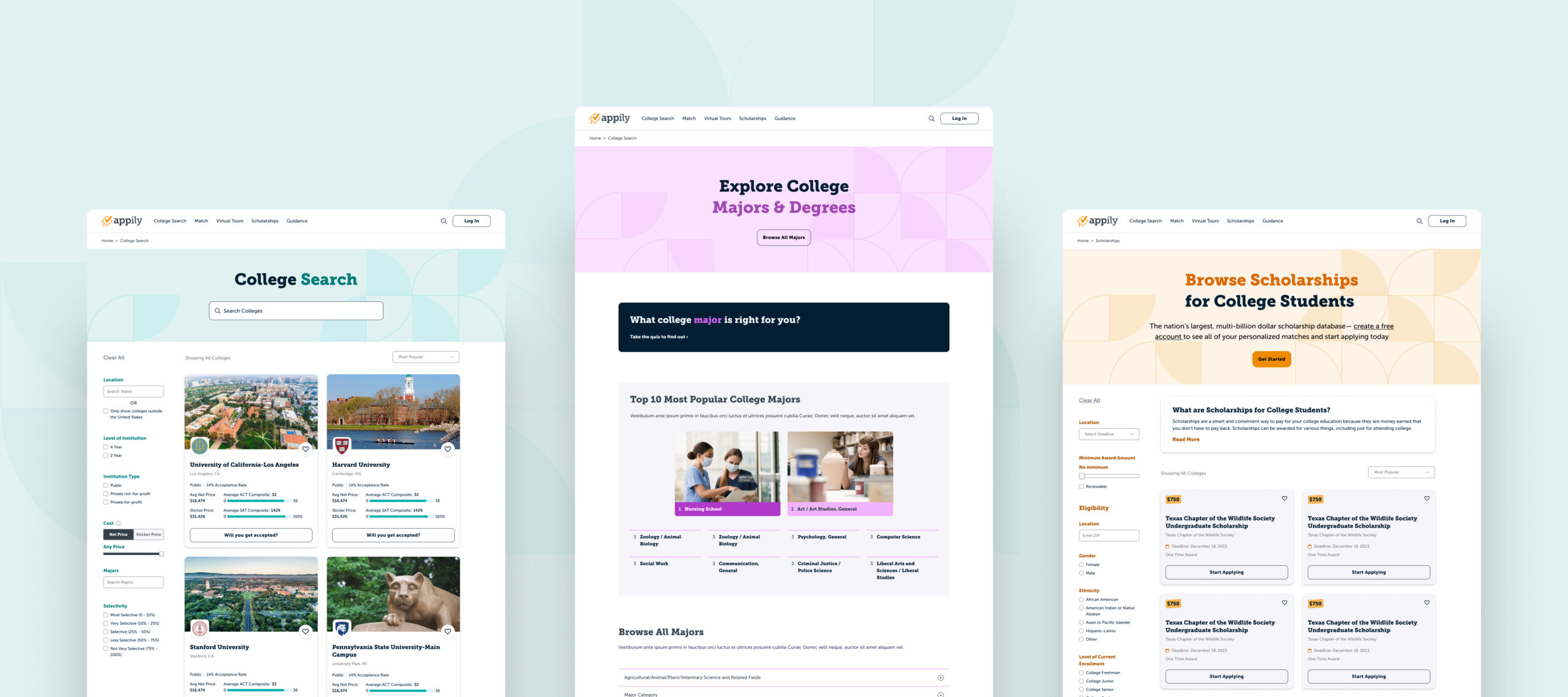
We balanced the brand implementation with development efficiency to get great results on a budget.
The redesign was a huge success. Beyond a vastly different look and feel, an informal result from the effort shows that leads from the website are considered up to ten times more valuable to universities (Appily’s customer base). We are proud of our work together and look forward to continued success in our relationship.
10x
Higher lead quality
