
If part of your marketing strategy is content creation, you need every advantage you can get over the competition. Optimizing your content’s images for quick-loading articles is often overlooked. This blog post outlines best practices for optimizing images to enhance website performance without compromising quality. We hope this post helps content managers make decisions that improve page load times, boost SEO rankings, and ensure a positive user experience.
Introduction to Image Optimization
Optimizing media content involves selecting the correct file formats and compression techniques to reduce file sizes, which improves load times and overall website performance. This process is essential for maintaining a competitive edge.
Choosing the Right Image Formats
Choosing the correct image format is one of the most commonly overlooked areas for optimizing images. When the web was young, this was an obsession for many website owners, but as high-speed connections have become the norm, it is easy to forget these rules.
When saving an image for the first time, the key to high performance is choosing the correct format. It’s important to note that image formats that use “lossy” compression (image information is lost when you save it) can’t always be resaved to reduce their file size once they’ve been saved. For example, Once an image has been saved as JPG, resaving it in a different format will include compression information left over from saving it as a JPG first. It’s always best to resave from the original image if available.

JPEG
- Best for: Photographs and realistic images.
- Pros: High compression ratio, widely supported.
- Cons: Lossy compression can degrade quality with high compression levels.

PNG
- Best for: Images requiring transparency or logos (especially for faded transparency and drop shadows).
- Pros: Lossless compression, supports transparency.
- Cons: Performs poorly when compressing photographs or other images with many variations in color.

GIF
- Best for: Best for simple animations and images with limited colors.
- Pros: Uses lossless compression, supports transparency.
- Cons: Limited to 256 colors and one transparency value.

SVG
- Best for: Icons and vector graphics.
- Pros: Scalable without loss of quality, small file size, supports transparency.
- Cons: Not suitable for complex images or photographs.

WebP
- Best for: Web graphics and when small file size is crucial.
- Pros: Superior compression techniques, supports both lossy and lossless compression.
- Cons: Not universally supported by all browsers (e.g. those on older devices or legacy systems thats run on outdated OS).
When to Use Which Image Type
I’m a more visual person, so let’s talk about when to use which type:
- Photographs: Use JPEG for a balance of quality and file size.
- Graphics with Transparency: Opt for PNG.
- Icons and Logos: SVG is ideal for scalability and performance.
- Web Graphics for Performance: WebP offers an excellent compromise between quality and file size.
Choosing Vector vs Raster
Image data comes in two main flavors: vector and raster. In our examples, we used both types.
Vector images use paths defined by mathematical equations, allowing them to maintain crispness and clarity at any size. This resolution-independent nature makes them ideal for applications where scalability is crucial.
Standard vector file formats, including SVG, AI, EPS, and some PDFs, are frequently used in designs requiring resizing without losing quality. Vector images, with their versatility in maintaining quality across different sizes, are the preferred choice for projects involving logos, icons, and illustrations where precise lines and the ability to scale are essential. This versatility makes them a staple in corporate branding and print, but SVG is the only file format used on the web.
In contrast, raster images are made up of a grid of pixels, each with an assigned color value, making them resolution-dependent. This pixel-based composition means raster images can lose clarity and become pixelated when enlarged.
Common raster formats such as JPEG, PNG, GIF, and TIFF are well-suited for digital photos and web images where detail and color richness are priorities. Raster images, with their ability to capture intricate details and subtle color gradients, excel in detailed photographs, complex textures, and digital artwork. When high detail and color depth are essential, particularly in web imagery and photo editing, raster images are the optimal choice. Most browsers support only JPG, PNG, and GIF.
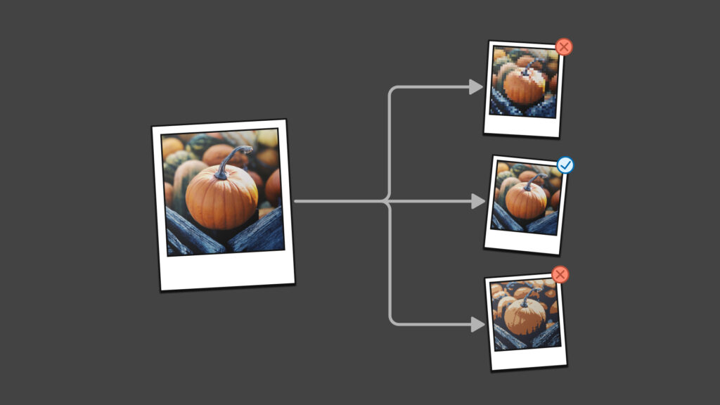
Looks Can Be Deceiving!
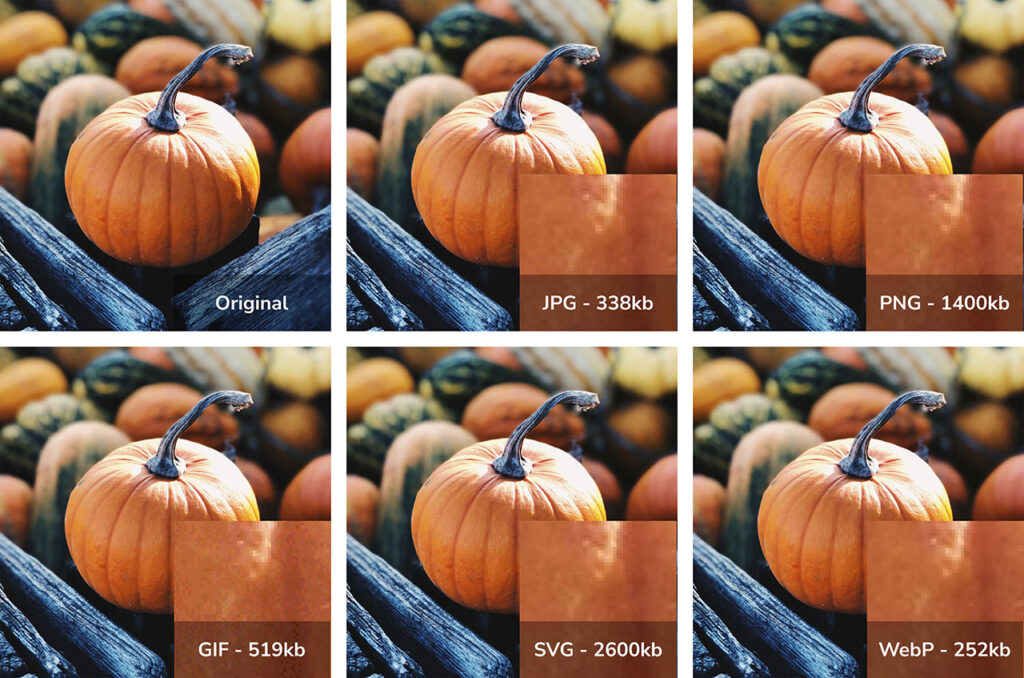
File Types
- JPG – 338kb
- PNG – 1400kb (1.4mb)
- GIF – 519kb
- SVG – 2600kb (2.6mb)
- WebP – 252kb
Each of these images has been saved as 1080px by 1080px square. At this size, you really can’t tell the difference between them, but the file sizes are drastically different.
From a best practice perspective, you should aim for images in content to be as small as possible. We like to use 100kb-250kb as a general high limit for images. You should consider reducing this limit if multiple images are on a page. That doesn’t mean you need to reduce the file size of an awesome infographic; it just means you should be more mindful as a general practice.

Let’s compare load times against image formats. Longer load times/taller bars are worse in this chart. We can see that the SVG in this scenario took the longest to load while the WebP was the shortest to load. In this scenario, we’re measuring against a slower connection, like a mobile phone user or a residential home office with a 4G connection (100 megabits per second).
Most blog posts have three images, so this load time needs to be multiplied by three for a more realistic scenario. A fast article page should load in about two seconds. With images saved as SVGs or even PNGs, this would be an unacceptably long load time and impact the user experience.
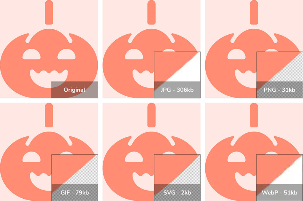
File Types
- JPG – 306kb
- PNG – 31kb
- GIF – 79kb
- SVG – 2kb
- WebP – 51kb
Each of these images has been saved as 1080px by 1080px square. Again, we don’t have noticeable differences between these images until we zoom in. Note that JPG is the only format that does not have transparency.
In this case, since we’re dealing with flat vector graphics, SVG has a huge advantage as that is the only format that can efficiently capture that data. SVG is 15x faster than PNG, which is the next best format. 150x faster loading than a JPG.
Many typical service listing pages have icons to represent each service. With six icons on the page, you can understand how this load time can really add up.
Other Image-Related Performance Challenges
Ok, so let’s say you’ve saved your images in the right format. Here are a few other tactics that can be used to make your images load faster.
Image Compression
Image compression is a fundamental method for optimizing image performance, focusing on reducing file sizes while maintaining acceptable visual quality. This process is essential for improving webpage load times and ensuring a seamless user experience. Various tools like TinyPNG, ImageOptim, and Adobe Photoshop offer efficient compression options that can significantly decrease file size without noticeable quality loss.
The key to successful image compression lies in the balance; it’s crucial to adjust compression settings to achieve the smallest possible file size that still retains the necessary level of detail and clarity. By carefully managing this balance, you can deliver visually appealing content without compromising on speed or usability, ultimately enhancing the overall performance of their digital platforms.
Resize Images
Resizing images is a crucial step in optimizing image performance, as it directly affects file size and display quality. Scaling images to the maximum dimensions they will be displayed on a webpage removes unnecessary data, leading to significantly reduced file sizes. This reduction enhances page load times and ensures that bandwidth is used efficiently.
Proper resizing ensures that images appear sharp and clear on all devices, avoiding pixelation or blurriness that can occur when the browser scales down a large image. By carefully managing image dimensions, you can deliver high-quality visuals that load quickly, improving user experience across all devices.
It is important to note that most mobile phones have a higher pixel density than desktop computers, so if you have a large mobile audience, you should test your image quality on mobile, to find the best balance in performance versus quality (and/or implement responsive images, which is up next).
Responsive Images
Responsive images are an effective strategy to optimize image performance by ensuring users receive the best possible image for their specific device and screen size. The srcset attribute in HTML allows developers to specify multiple image sources for different resolutions and displays, enabling the browser to select the most appropriate image based on the user’s device capabilities. This technique significantly enhances user experience by reducing unnecessary data load, as users on mobile devices receive smaller, optimized images, while those on larger screens receive higher-resolution versions.
Responsive images help improve page load times and reduce bandwidth consumption, which is particularly beneficial for users with slower internet connections or limited data plans. You can deliver high-quality visuals that adapt seamlessly to any viewing context by implementing responsive images, ensuring a consistent and efficient user experience across all platforms.
Lazy Loading
Lazy loading is an innovative technique for optimizing image performance by deferring the loading of images until they are needed, typically as the user scrolls down the page. This method significantly reduces initial page load times, allowing content above the fold to appear quickly and improving the overall user experience. By loading only the images that are visible within the user’s viewport, lazy loading decreases the amount of data required upfront, which is particularly advantageous for users with slower internet connections.
This approach conserves bandwidth and enhances site performance by reducing server load and improving resource management. By implementing lazy loading, you can ensure that webpages are fast, efficient, and responsive, all of which contribute to increased user engagement and satisfaction.
Use a Content Delivery Network (CDN)
Utilizing a Content Delivery Network (CDN) optimizes image performance by distributing content across geographically dispersed servers. CDNs are particularly beneficial if your company has global operations.
This approach ensures that images are delivered from a server closest to the user, minimizing latency and accelerating load times. CDNs work by caching images and other static content in multiple locations around the world, allowing users to fetch data from nearby servers rather than a central server that may be far away. This enhances speed and reduces the load on the origin server, improving overall website reliability and scalability.
CDNs often include built-in optimization features, such as automatic image compression and format conversion, further enhancing performance. By leveraging a CDN, you can provide fast, reliable access to their visual content, ensuring a seamless and efficient user experience across diverse geographic locations.
Leverage Browser Caching
Leveraging browser caching is a strategic approach to optimizing image performance by storing copies of images on a user’s local device after their initial visit. This technique allows repeat visitors to load previously cached images directly from their device’s storage rather than downloading them again from the server, significantly reducing load times for subsequent visits. Caching works by setting appropriate cache headers, which define how long a browser should store images before checking for updated versions.
This enhances speed, reduces bandwidth consumption, and decreases server load, allowing servers to handle more requests efficiently. Implementing browser caching improves user experience by providing faster, more responsive interactions. It encourages users to revisit the site, knowing it will load swiftly and smoothly.
While we do recommend implementing every tactic available, it is essential to note that this improvement is less beneficial for first time visitors. We suggest prioritizing other improvements before this one.
Optimize Image Delivery
Optimizing image delivery is a vital step in enhancing image performance, leveraging modern techniques such as HTTP/2 and specialized image Content Delivery Networks (CDNs). HTTP/2 introduces multiplexing, allowing multiple image requests to be sent simultaneously over a single connection, significantly reducing load times and improving overall efficiency. This protocol also includes header compression and prioritization, further optimizing image delivery and enhancing user experience.
Image CDNs go beyond traditional CDNs by offering tailored solutions for image delivery, including features like real-time image optimization, automatic format conversion, and adaptive image sizing based on device and network conditions. These advanced capabilities ensure that images are delivered quickly and in the optimal format and size, catering to the specific needs of each user. By integrating these modern delivery techniques, you can provide a faster, more efficient visual experience that meets the demands of today’s diverse and dynamic digital landscape.
Optimizing delivery is our favorite tactic as it can often implement several of the above tactics simultaneously. Cloudflare is one of the SAAS providers that do this best. However, it isn’t an excellent solution for organizations with complex DNS as it typically takes over as the location for DNS management. The upgrade to implement without changing DNS providers is quite expensive. For that reason, IT heavy organizations do not usually like this solution.
Conclusion
Optimizing media content is a pivotal aspect of enhancing website performance. By carefully selecting the appropriate formats for images and considering the trade-offs between hosting images on-site versus using external services, content managers can significantly improve page load times and user experience. Implementing the strategies outlined in this guide will ensure that your website remains competitive, engaging, and accessible to all users.
This certainly isn’t the only tactic to improve website performance, but it’s a start and is often overlooked. Stay tuned for more optimization tips and tricks. If you need help improving your site speed, contact us, and we can help diagnose and create a plan to optimize performance.