As your business begins an engagement with an agency, every stakeholder in your organization views a website redesign differently. Your head of sales has a vision for how the new website should look to meet their needs, while the executive team may have a different set of priorities. Factor in the subjective nature of visual design, and bringing your company to a consensus feels like a monumental task.
The design phase should be the most exciting part about building a new site. But it can be difficult to navigate. As the facilitator of this collaboration, it’s the marketing director’s job to ensure all of your internal perspectives are aligned toward finding the same result. As difficult as that may sound, you can draw the most from your agency’s expertise by applying the right tool. And the first critical step is aligning your priorities through a shared language.
Understanding and communicating the look your website needs can be difficult for those without a design background. All your stakeholders must take an objective look at what visual elements best suit your brand rather than their personal preferences. With an organized approach, you can streamline the design process to establish the clearest direction from your team – and your agency as well.
Understanding the Primary Elements of Design
Before you can talk about your brand’s digital needs, you need to understand the two core components of an effective website design.
First is its user interface, which ensures each visitor understands how to navigate your site and reinforces their ability to find what they need. Your agency’s skilled UX designers will work with you to ensure your design meets usability standards.
Second is your site’s visual design, which reinforces the brand experience. When a user arrives at your website, everything they see should provide a consistent reflection of your brand’s identity and its story.
There are three primary elements of visual design that will form the building blocks of your website:
- Imagery: How will you represent your brand, products, or services?
- Color: What tones and textures are aligned closest with your brand?
- Composition: How are all of your elements displayed on a given page?
Changes to these three elements make a dramatic impact on the tone and quality of your website design. Unfortunately, these core components are also the areas your internal stakeholders may find most difficult to discuss. They may be unclear on the definition, or respond with personal preferences rather than focusing on your brand.
To ensure your organization draws the greatest return on investment from a redesigned or newly launched digital project, you have to establish design alignment across these three elements.
Like every business, you need a “modern” and “great” website. But how your team defines ‘great design’ is ultimately a subjective decision. To align these perspectives, you must place every design decision in the context of your brand’s identity and the website’s goals.
Building Consensus for Brand Stakeholders: The Design Alignment Chart
In visual design, context is critical. Teams often disagree about broad visual decisions such as how images, color, and composition will inform your website design. But when viewed through the contextual lens of your brand’s tone and voice and what resonates with your target audience, design discussions can gain renewed focus.
Before your agency can effectively begin work on your redesign, they have to know your brand. Not surprisingly, this is only possible if you and your stakeholders have the same understanding of your firm’s identity. With the help of a design alignment chart, you can start thinking about and discussing your visual priorities to ensure your agency sets off on the right direction.
During the discovery process, your agency can use this chart to facilitate internal conversations about your design needs. If you and your teams already know your brand, the chart is a means to quickly define your redesign’s direction. However, if your stakeholders have never considered your brand from a holistic point of view, the chart provides an interactive method to start.

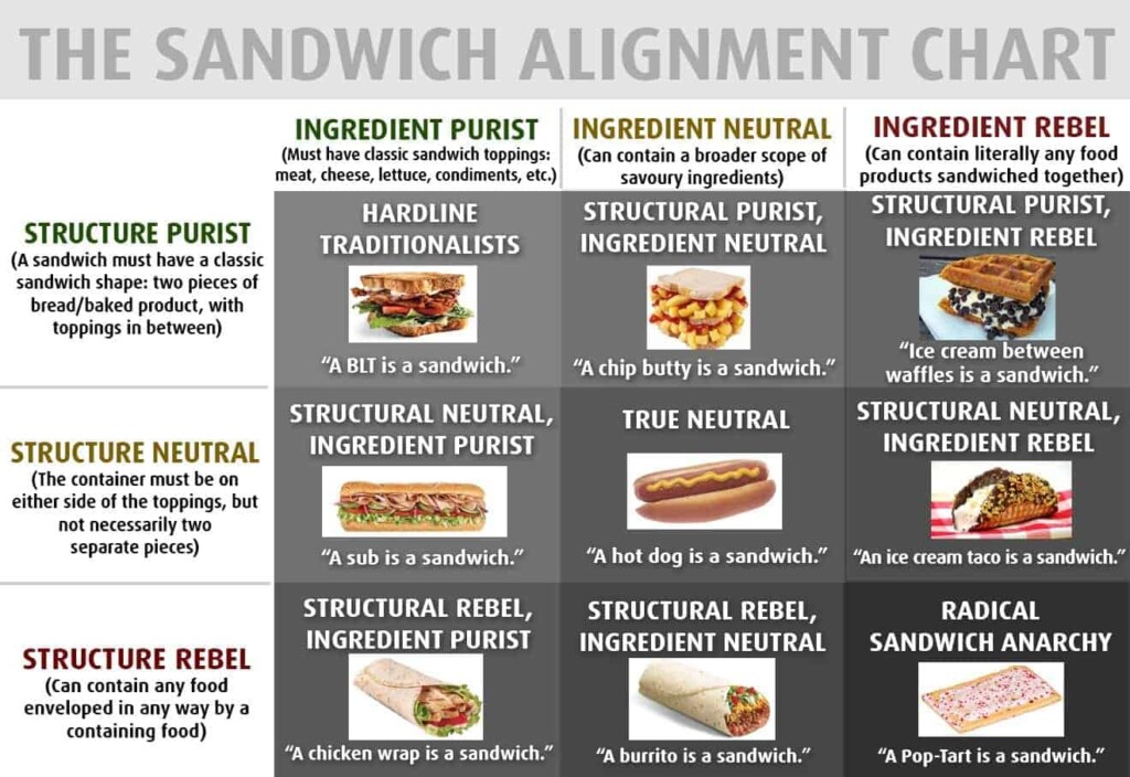
Our design alignment chart is inspired by a mix of “Dungeons & Dragons” character alignment and the viral “sandwich alignment chart.” Both of these charts identified a person’s traits in the context of a role-playing game or sandwich definition. The design alignment chart forms a clearer picture of the visual elements that define who you are as a brand.
The Design Alignment Chart in Action
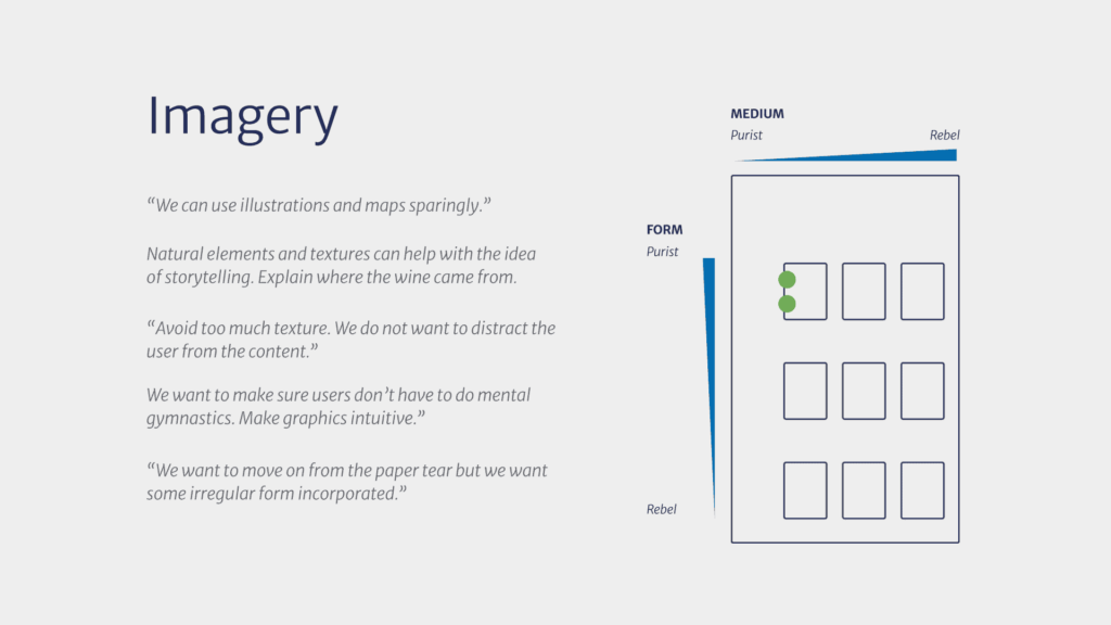
Instead of viewing the elements of visual design as open-ended questions, the alignment chart places each on a continuum. By evaluating each position in the context of your brand’s history, you better define what you’re looking for in a design.
For example, in the imagery portion of the alignment chart, one axis considers form a spectrum from literal to abstract. At one end is the purist, who considers images straightforward elements, such as literal photos of your products or team. At the other is the rebel, which tilts more toward abstract imagery. These elements may then be unconventionally framed to create more textured or metaphorical elements.

Another axis in the image-focused chart focuses on medium, which ranges from illustrations to photographs. The points in the chart where the axes and their three ranges of responses align create nine intersections. By evaluating the points where perspectives intersect, you draw a clearer picture of your brand identity and its digital needs.
Design Alignment Provides Direction for Your Website and Agency
Any engagement with a digital agency centers your ability to have deep conversations about your brand’s needs. By starting these discussions early, you gain more than a clearer understanding of the elements of a strong digital design. You recognize the areas within your teams that require further attention to create an aligned perspective.
Getting an honest gauge on what’s appropriate for your brand paves the way for your agency to conduct more abstract design discussions with your team going forward. For any agency, their worst-case scenario isn’t just delivering work that doesn’t solve your organization’s problem; it’s the sense they’re acting without your input.
By learning how to talk about your brand and its needs inside your organization, you become a better partner with your outside collaborators. And that partnership is the most important component in delivering a strong design and effective digital platforms.


